Please post your updates as a comment on this post. Include links to any sketches, code, prototypes, notes, graphics, data-files, etc! Show me TANGIBLE progress.
Remember, these updates are part of your final grade for the project/course, and are required assignments.
Hi!
So far so good. I have a spreadsheet created of the letters I went through at BHS. I am using the spreadsheet data to write an Abstract, Scope & Content as part of my finding aid.
this is how I see the finding aid –
Video One: Abstract/ My voiceover along with a great image I took of the box of content (Ken Burns & Civil War themed music I found)
Video Two: Scope and Content/ My voiceover along with another great image I took of all the letters scattered on a desk ( Ken Burns & Civil War music)
Video Three: A letter read aloud over the image of the letter
Video Four: A letter read aloud over the image of the letter
All of these videos displayed in a webpage that is clickable – The webpage is simple design & layout – with a BHS logo ( I never found a picture of good ole’ Alfred Cranston). I want to post my spreadsheet and a screenshot of the first video but how do I attach to this post?
Aditi, remember when we learned how to upload files to the new school server? Upload your spreadsheet and screen shot, and then post links (URLs) to those files on the server. I’d also love to see a sketch of the page (just pen and paper) of the layout of the page.
Oh yes! I totally forgot about the server uploading. Ok, I’ll get all the materials up for your review.
Thanks
A
I’ve posted all the materials in my public folder on the server.
http://webspace.newschool.edu/~shara627/CranstonProjectUpdated
anytime I try to access the link it keeps saying that I dont have permission. Idk maybe its because I am not at school and I am accessing the folder?
I can’t figure out how to upload my photos to the server, unfortunately, but Zannah, I will just email some of them to you. So, I’ve been thinking about doing something slightly different than these Felton-style call-outs. Of the 8 pieces I pulled out from each letter, I think the “emotions”, the sign-off, and my favorite phrase are the most interesting. What if I created a kind of emotional line graph? Frustration, boredom, and strained being at the bottom, passion, anticipation, sexiness, and inspiration at the top, with wistful, playful, and empathetic in the middle? There would be more, but you get the idea. The date would be at the bottom (the 30 letters works out to just about a month since he wrote her every day, though he unfortunately starts mid-month) and at each point of intersection I would include a rendering of the sign-off and my favorite phrase?
We can discuss tomorrow, but I feel very excited by this idea!
My internet is being a little wonky, so I am posting my data and sketch as links from Google Docs.
I wasn’t able to track down another copy of Cosmopolitan except the one on stands, and the search on the website makes it really difficult to find articles from a specific month. But, I think that they are pretty formulaic as far as content goes, so I’m not that concerned.
What I will be visualizing:
Price (just expressed in a visually appealing way)
Number of Female vs Male writers (pie chart)
Frequency of topics covered (bar chart)
Word Clouds of Article Titles
Average length (would love suggestions on how to visualize!)
Also, I will be creating an interactive timeline of the New York Woman covers.
I would have liked to actually have some of the graphs created, but I have been sidetracked by another project.
https://docs.google.com/spreadsheet/ccc?key=0Anv4RjCmUhQxdHZoekVxTF9KM082Tk1Qc1ZJQ1JYaEE
https://docs.google.com/spreadsheet/ccc?key=0Anv4RjCmUhQxdFZvRklSNUFCVE1PMXV2QnZ3QnFiaGc
https://docs.google.com/open?id=0B3v4RjCmUhQxcGJSYXNXY3N6TmM
Stephanie,
It looks like several years of current issues of Cosmo are available at the NYPL main branch periodical room in bound form http://tinyurl.com/avg4ym9. I think your project will really benefit from having this additonal data– right now you have twice as much of the BHS data and it would be a much better comparision if you had the same volume of contemporary data… They’re open Saturday during the day.
In terms of the price visualization– no matter what the format (and it will be a challenge to make this statistic interesting) don’t forget to adjust for inflation…
My Williamsburg property value mapping project is progressing nicely. So far, I have:
- Taken photographs of the 1845 property map at the Brooklyn Historical Society
- Recorded all the data and handwritten notes from BHS map (Map Data spreadsheet and Map Notes docs)
- Visited and photographed all 48 plots in their current state (Maps and Buildings folders) — Due to all the street parking and interference of cars, I decided it was best to photograph just the ground floor of each plot.
- Selected photographs for use on final map
- Translated all 1845 plot numbers into modern day addresses
- Added data regarding current locations including business names and corresponding image file names (Map Data spreadsheet)
All of my documents reside in this folder on Google Drive:
https://docs.google.com/folder/d/0B4j_bNWc13KWcG5TMDV0RjQwNk0/edit
I just started researching the Google Maps API and alternative mapping applications, but I still need to:
-Touch up and resize my photographs for the web in Photoshop
-Research current property value assessments and add them to the Map Data spreadsheet
-Sketch out mock-ups
-Create the final map and post it online
While I still have a good amount of work cut out for me, I’m happy with how everything is coming together thus far.
In tonight’s help session, Sepand and Zannah and I worked out some of the html/jquery code that will be the basis for my iPad app demo. I brought in a handful of sample “pieces” I made from printing some of of the photos we took at BHS on Saturday and gluing them to post-it’s with some basic identifying data written on them. This gave us something to move around and tomorrow I will have more pieces to play with in class. The idea is that a couple of people from class can experiment with the pieces and I can map what they do which will help me figure out what they found important–organizationally and narrative-ly speaking–and apply that to how I structure the data and UI for the app.
I also spoke with a coworker who is studying arts administration at NYU and who is very knowledgeable about issues with archived collections in museums and libraries. She made two points that I’m considering: she told me about a museum in Columbus Circle that has a touch screen interactive display that allows users to browse inactive collections, sorting by material, era, artist etc; the other is an online crowd sourcing project where a museum invites its website users to tag their collections. I don’t necessarily want users tagging the pieces in the app I’m mocking up, but if the pieces are already tagged it could be a useful feature to help users “discover” and feel engaged in making connections.
All of my files are in this dropbox folder:
https://www.dropbox.com/sh/webkzxnpapgwrdy/KM9Zm4oOdu
I wish we’d had a class on parsing data, because extracting the info I needed from 2000 lines of excel was by far the most challenging part of this so far, and took me about twice the time I expected it to. So far I’ve:
1. Extracted each map assigned to a neighborhood in excel, used it to create a new spreadsheet, and used formulas to count the number of instances of each and average the age of each.
2. Converted this data into three text data files, readable by max. I will use either 2 of these (one for age, one for instances) or use the 1 which combines the 2 sets of data, provided I can unpack it in max to discreet objects.
3. Begun building the structure of the max patch, mapping the neighborhoods to individual buttons which will trigger the numbers from the data text file when rolled over. I know most of you don’t have max, so there’s a screenshot of my progress so far in the main directory of the link above.
I also wanted to note that I decided against using different recorded sounds for each neighborhood because it occurred to me that with different sounds you’ll have different perceptions of loudness. In order for the data to be accurately “heard” I think it’s important that the same sound is used for all, so that the differences can be accurately perceived. I will use either a max generated sound or ONE local recording if I can find one that will work for this purpose.
Hello,
I’ve aggregated my progress on this post: http://jimenazuluaga.com/the-inspector-generals-best-friends-work-in-progress/
(Password: data)
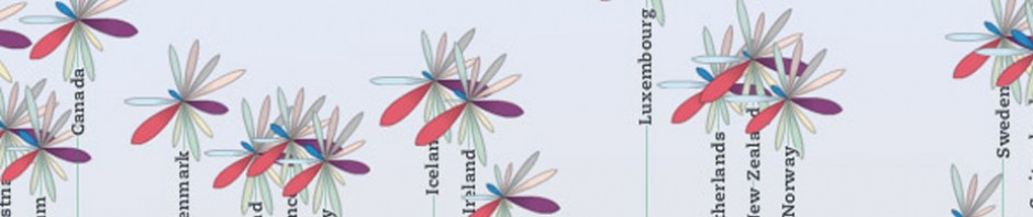
A data visualization of the HDI(Human development index http://en.wikipedia.org/wiki/Human_Development_Index) and HPI (happy planet index-http://en.wikipedia.org/wiki/Happy_Planet_Index).
All my data set is public and accessible on the web site at http://hdr.undp.org/en/statistics/ and on the HDI page.
I target people interested in , ecology, geopolitics, energy, politic, humanity.
I want to illustrate inequity with in or in-between countries, and raise question about the economical model.
The choice of the data I will choose is arbitrary. I plan to play with data, highlight details to illustrate the disparities.
The challenges is going to be to filter the large database available online; pick parameters of comparison which illustrate my point.
Contextual Review
Work of César A. Hidalgo, on data ( http://www.chidalgo.com/data.html ) most particularly is work on the HDI, Data.( http://www.forbes.com/sites/jonbruner/2010/11/18/a-new-way-to-look-at-the-human-development-index/)
Data selection
I plan to cross data about economy health education and ecology.
1 correlation between economy and health
2 correlation between economy and education
3 carbon dioxide emissions and population
I am in the process of selecting the data and the country I plan to use and illustrate.
Hi all,
Here is what I have so far:
http://www.maryfiner.com/data-project/
Here is a link to the Google Map, which has links to each image on the BHS site: https://maps.google.com/maps/ms?msid=206698129566347654999.0004cfbe5ed95928f1f6f&msa=0
The map will be embedded on the page (to be built).
I also have data on how many color vs. black & white images there are for each year. I would like feedback on the most effective way to represent that.